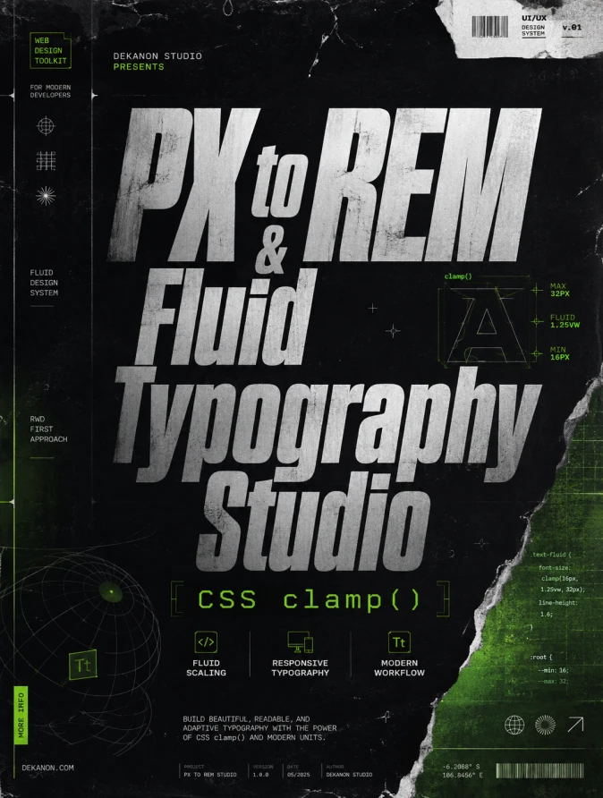
A high-end commercial graphic design poster with a 3:4 aspect ratio, embodying a premium Streetwear aesthetic. The focal point features the text 'PX to REM & Fluid Typography Studio' in massive, bold, distorted sans-serif typography with a slight metallic sheen. Below it, the sub-headline 'CSS clamp()' is rendered in a sharp, technical monospaced font. The composition is an award-winning masterpiece of visual hierarchy, featuring layered elements like technical blueprints, distressed paper textures, and subtle glitch effects. The color palette is a harmonious professional mix of deep obsidian, electric matrix green accents, and cool grays. Elements are placed with intentional breathing room and balanced negative space. Lighting is professional studio-grade with cinematic soft shadows and high-end textures like matte carbon fiber and brushed aluminum. Award-winning design, 4k resolution, agency-grade post-production, sharp focus, ultra-detailed technical overlays, and commercial-grade polish.
👁 69
Home
/
Webapp /
PX to REM & Fluid Typography Studio |
DekaNon Labs
PX to REM & Fluid Typography Studio
Labels
Web App
★★☆☆☆ |
Development |
Actively improving.
🔤 PX to REM & Fluid Typography Studio
Konversi nilai piksel ke REM dan hasilkan rumus CSS clamp() otomatis agar font desain Anda fleksibel di semua layar.
Tool ini menyelesaikan masalah utama desain modern: membuat font dan elemen visual otomatis menyesuaikan (responsive) dari layar HP hingga monitor desktop tanpa kaku, menggunakan fungsi clamp() CSS secara praktis.
💡 Fungsi & Fitur Utama Tool
Konverter PX ke REM (Konstanta Base Presisi): Mengubah nilai piksel (px) menjadi rem secara instan berdasarkan ukuran root font size (default 16px, bisa disesuaikan).
Generator Fluid Typography (clamp() CSS): Menghitung rumus responsive font otomatis yang bisa membesar/mengecil dengan halus saat ukuran layar (viewport) berubah.
Interactive Viewport Slider & Preview: Bisa menggeser lebar layar (Viewport Width) secara real-time untuk melihat animasi langsung bagaimana teks membesar atau mengecil.
Copy Ready-to-Use Code: Menyediakan tombol salin siap tempel untuk CSS rem murni maupun fungsi clamp().
💬 Feedback (0)
📢 Latest Update
Tombol Download QR Code (.png): Hasil QR Code yang digenerate sekarang bisa langsung diunduh secara instan dalam format file PNG berkualitas tinggi.
Pilihan Tingkat Kerumitan (Error Correction Level): Ditambahkan kontrol untuk memilih tingkat kerumitan QR Code (Rendah / Sedang / Tinggi). Secara default sudah diset ke Sedang (Medium) agar tampilan garis-garis barcodenya tidak terlalu padat/rumit, namun tetap sangat mudah di-scan oleh kamera HP.