Home
/
Getside /
TIGA | GET the Side They Can’t Define |
DekaNon Labs
| DKN//
27.10.2026
TIGA | GET the Side They Can’t Define
Labels
PostA
GETSIDE.
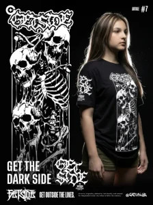
GET OUTSIDE THE LINES.
Typography / Visual Identity / 03
GET THE SIDE
THEY CAN'T DEFINE.
Independent by nature.
Experimental Blackletter
Getside Experimental lettering
03 / Visual Analysis
Beyond The Rules. Beyond The Ordinary.
This composition explores the expressive potential of
experimental blackletter typography. Intricate letterforms
overlap and intertwine, creating a dense visual structure
defined by sharp terminals, elongated strokes, and dramatic
curves.
The contrast between solid white lettering and a deep black
background emphasizes every edge and intersection. Rather
than prioritizing immediate readability, the design invites
the eye to explore its complexity and discover its visual
rhythm.
Its character is dark, rebellious, and deliberately
unconventional — a visual expression that challenges the
familiar without relying on unnecessary decoration.
02 / Design Philosophy
Identity
Without Permission.
Not every form needs to follow a familiar structure.
This typography embraces complexity as part of its identity,
turning unconventional letterforms into a statement of
creative independence.
The overlapping strokes resist predictable patterns.
Their irregular rhythm gives the composition a distinctive
presence, suggesting that individuality does not need to
be simplified to be recognized.
For GETSIDE, originality begins where imitation ends.
The objective is not to follow an established visual
language, but to develop an identity that feels personal,
expressive, and unmistakably different.
GETSIDE / Independent Minds
Some identities were never meant to
fit inside the lines.
03 / The Editorial
A Language Of Its Own.
Some identities were never meant to fit inside the lines.
Built from intricate blackletter forms, sharp extensions,
and overlapping strokes, this composition transforms
typography into something more expressive than ordinary
lettering. Its complexity creates a visual language of
its own — bold, unpredictable, and deliberately unconventional.
Every curve challenges simplicity. Every sharp edge disrupts
the expected. Together, they form an identity that refuses
to be reduced to a familiar shape.
GETSIDE is for the minds that create their own direction,
embrace their differences, and never wait for permission
to stand apart.
1
/
1
Protected Download
This download is protected.
Enter the password to continue.