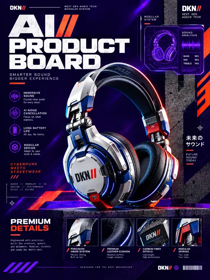
A high-end commercial product photography shot of a futuristic AI Product Board, embodying a fusion of Cyberpunk, Neo Brutalism, and Streetwear aesthetics. The central focal point is a sleek, modular hardware interface with glowing circuit patterns and holographic displays. The composition follows strict Neo Brutalist principles with heavy black borders, raw concrete textures, and bold asymmetric layouts. Lighting is professional studio grade with high-contrast cyan and orange rim lights reflecting off matte metallic surfaces. Visual elements include oversized sans-serif typography overlays and industrial design accents. Place elements with proper breathing room, ensuring a balanced visual hierarchy. High-end textures include brushed aluminum, carbon fiber, and tactical nylon. Commercial grade, award-winning design, 4k resolution, masterpiece, intricate detailing, cinematic depth of field --ar 3:4
👁 122
Home
/
Blogs | Prompt /
AI Product Board: Reference Sheet untuk Foto Produk, Katalog & Iklan |
DekaNon Labs
AI Product Board: Reference Sheet untuk Foto Produk, Katalog & Iklan
Labels
PostA
×
AI Product Reference System
AI Product Board:
Reference Sheet
untuk Foto Produk, Katalog & Iklan
Sebuah reference system untuk membantu AI memahami identitas produk
sebelum produk tersebut dipindahkan ke berbagai scene, angle,
lighting, katalog, marketplace, social media, maupun campaign advertising.
Reference image adalah titik awal. Board yang baik bukan sekadar
kumpulan foto, tetapi kumpulan informasi visual yang membantu creator
menjaga identitas produk ketika menghasilkan banyak variasi gambar.
AI PRODUCT BOARD / MASTER REFERENCEProduct identity anchor
03 / Introduction
Apa sebenarnya AI Product Board?
AI Product Board adalah reference sheet yang
mengorganisasi identitas visual sebuah produk ke dalam satu sistem
referensi. Tujuannya bukan sekadar menunjukkan seperti apa produk
tersebut, tetapi membantu creator mendefinisikan karakter yang harus
dipertahankan ketika produk digunakan dalam berbagai kebutuhan visual.
Dalam workflow AI image generation, masalah yang sering muncul bukan
hanya kualitas gambar. Masalah yang lebih sulit adalah ketika produk
yang seharusnya sama mulai berubah bentuk, ukuran, warna, material,
detail, logo, packaging, atau proporsinya pada setiap generasi baru.
Product Board bekerja sebagai master visual reference.
Creator dapat menentukan bagian mana yang merupakan identitas produk
dan bagian mana yang boleh berubah sesuai kebutuhan scene.
Prinsip sederhananya:
Jangan meminta AI menciptakan produk yang konsisten dari nol pada
setiap prompt. Bangun terlebih dahulu sebuah reference system yang
menjelaskan produk tersebut secara visual.
Setelah identity cukup jelas, barulah produk ditempatkan ke dalam
scene baru seperti studio photography, lifestyle campaign,
e-commerce, billboard, social media advertisement, atau editorial.
04 / Why It Matters
Kenapa AI Product Board penting?
Product Board membantu memisahkan identitas produk dari kreativitas
scene. Ini penting ketika satu produk harus menghasilkan banyak aset
visual tetapi tetap terasa sebagai produk yang sama.
01
Identity
Menentukan bentuk, siluet, proporsi, warna, material, packaging,
dan detail utama yang menjadi identitas produk.
02
Consistency
Membantu menjaga karakter visual produk ketika dibuat dalam
berbagai angle, scene, dan kebutuhan campaign.
03
Detail
Close-up dan detail material membantu creator mengkomunikasikan
informasi visual yang mungkin hilang pada satu foto saja.
04
Reference
Semua generasi baru memiliki titik acuan yang sama sehingga
workflow tidak bergantung hanya pada deskripsi teks.
05
Workflow
Reference dapat digunakan kembali untuk katalog, marketplace,
advertising, social media, dan visual campaign berikutnya.
06
Production
Creator dapat membangun banyak visual dari satu master identity
tanpa harus mendefinisikan ulang produk dari awal.
05 / Deep Education
Reference bukan sekadar gambar tambahan.
Dalam workflow generative image, reference dan prompt memiliki
pekerjaan yang berbeda. Memahami perbedaannya membuat proses
menghasilkan visual produk menjadi lebih terkontrol.
Core Principle
Identity menjawab:
“Produk apa yang harus dipertahankan?”
Style menjawab:
“Produk tersebut ingin ditampilkan dengan suasana seperti apa?”
Scene menjawab:
“Produk tersebut ditempatkan di mana dan untuk kebutuhan apa?”
01
AI bekerja dengan informasi visual dan tekstual
Prompt memberikan instruksi konseptual, sementara reference
membantu memberikan informasi visual yang lebih konkret.
Keduanya dapat saling melengkapi, tetapi tidak selalu
menghasilkan identitas yang identik pada setiap model AI.
02
Reference membantu mengurangi ambiguitas
Kata seperti “minimalist white bottle” masih memiliki banyak
kemungkinan interpretasi. Reference yang jelas mempersempit
ruang interpretasi terhadap bentuk, proporsi, warna, dan detail.
03
Identity dan styling sebaiknya dipisahkan
Produk harus tetap menjadi produk yang sama, sementara background,
lighting, props, camera mood, dan composition dapat berubah
sesuai kebutuhan campaign.
04
Jangan membuat reference terlalu berisik
Board yang berisi terlalu banyak produk berbeda, lighting
berbeda, atau styling ekstrem dapat membuat reference kehilangan
fokus. Prioritaskan informasi yang benar-benar menentukan identity.
05
Master reference menjadi pusat workflow
Setelah identity tervalidasi, gunakan master reference tersebut
sebagai titik awal untuk membuat variasi visual. Dengan begitu,
creator memiliki sumber acuan yang dapat digunakan kembali.
06 / Components
Elemen yang ideal di dalam Product Board
Tidak semua produk membutuhkan jumlah reference yang sama. Prinsipnya
adalah memasukkan visual yang membantu menjelaskan identity dari
berbagai sisi tanpa memenuhi board dengan informasi yang tidak perlu.
Hero Product
Satu tampilan utama yang paling mudah mengenali produk dan dapat
menjadi anchor utama untuk keseluruhan board.
Front View
Tampilan depan untuk memperjelas bentuk, layout, label, logo,
packaging, dan elemen utama.
Side / Rear View
Sisi dan bagian belakang membantu memperlihatkan depth, proporsi,
struktur, serta detail yang tidak terlihat dari depan.
Top / Bottom
Berguna untuk produk dengan bentuk tiga dimensi atau packaging
yang memiliki informasi penting pada bagian atas dan bawah.
Material
Tampilkan close-up permukaan seperti kaca, metal, kain, plastik,
kertas, kulit, kayu, atau material lainnya.
Color
Tentukan warna utama produk dan hindari membiarkan AI mengubah
warna identity ketika membuat scene baru.
Scale
Referensi ukuran relatif membantu produk tetap memiliki proporsi
yang masuk akal ketika ditempatkan bersama objek lain.
Detail Close-up
Perlihatkan jahitan, tekstur, finishing, tombol, cap, label,
emboss, handle, nozzle, atau detail khas lainnya.
Packaging
Penting untuk produk retail agar bentuk box, pouch, bottle,
wrapper, insert, atau label tetap konsisten.
Lighting Reference
Lighting dapat menjadi bagian reference ketika karakter highlight
dan shadow merupakan bagian penting dari visual produk.
Negative Constraints
Catat hal yang tidak boleh berubah seperti logo, warna, jumlah
komponen, bentuk tutup, proporsi, dan struktur produk.
Identity Notes
Tambahkan catatan singkat mengenai ciri paling penting yang harus
diprioritaskan saat melakukan generasi baru.
07 / 08 — Master Prompt
Master Product Identity Prompt
Gunakan prompt ini ketika ingin menjadikan reference sebagai
identity anchor utama. Prompt dirancang untuk menjaga bentuk,
proporsi, material, warna, packaging, dan detail produk sebelum
memasukkannya ke dalam scene baru.
MASTER PRODUCT IDENTITY
Use the uploaded product reference image as the highest-priority identity anchor.

Recreate the EXACT SAME PRODUCT shown in the reference, preserving its core visual identity before applying any new environment, styling, or commercial composition.

PRODUCT IDENTITY PRIORITY:
- Preserve the exact overall silhouette and recognizable shape.
- Preserve the original proportions and relative dimensions.
- Preserve the exact primary color family and important color relationships.
- Preserve material appearance, surface finish, texture, reflectivity, transparency, and roughness.
- Preserve all distinctive structural elements.
- Preserve the exact placement and visual treatment of logos, labels, typography, buttons, caps, handles, seams, openings, edges, and packaging components when visible.
- Do not redesign, simplify, beautify, reinterpret, or invent product features.
- Do not merge the product with characteristics from unrelated reference objects.

REFERENCE INTERPRETATION:
Treat the uploaded reference as the master product identity rather than as a loose inspiration.
When a new scene, background, camera angle, lighting setup, or styling instruction is introduced, change only the requested presentation layer while keeping the underlying product identity stable.

CAMERA:
Create a professional commercial product-photography composition.
Use a realistic camera perspective with natural proportions.
Avoid extreme wide-angle distortion unless specifically requested.
Maintain believable product scale and geometry.

MATERIAL AND DETAIL:
Render realistic material response, physically believable highlights and shadows, accurate surface texture, clean edges, realistic seams and joins, and commercially usable detail.
Preserve subtle imperfections when they are part of the original product identity.

LIGHTING:
Use controlled professional studio lighting with clean directional illumination, soft but readable shadows, realistic highlights, and sufficient separation between the product and its environment.
Lighting may be adapted to the requested scene, but must not change the perceived material or color identity of the product.

COMPOSITION:
Place the product clearly within the frame.
Keep the product as the primary visual subject.
Use balanced negative space and a premium commercial composition.
Do not allow props, background elements, or decorative effects to overpower the product.

CONSISTENCY RULE:
The generated result must remain visually recognizable as the same physical product from the uploaded reference.
Identity consistency has higher priority than decorative styling.

DO NOT:
Do not change the product shape.
Do not alter proportions.
Do not invent additional components.
Do not remove distinctive details.
Do not change the primary product color without explicit instruction.
Do not replace the original material with another material.
Do not redesign the packaging.
Do not generate a generic substitute product.
Do not combine multiple product identities.

OUTPUT:
Create a polished, realistic, commercially usable product image that preserves the reference product identity while following the requested scene, camera, composition, and lighting instructions.
Catatan: Tambahkan instruksi scene setelah prompt identity,
misalnya “place the product on a warm minimalist studio table” atau
“create a premium e-commerce white background”. Dengan cara ini identity
dan presentation layer tetap lebih mudah dipisahkan.
09 / Prompt Library
6 Prompt Variations untuk kebutuhan berbeda
Jangan menggunakan satu prompt untuk semua pekerjaan. Setiap variasi
berikut memiliki tujuan berbeda: ada yang fokus pada identity,
angle, detail material, e-commerce, advertising, dan packaging.
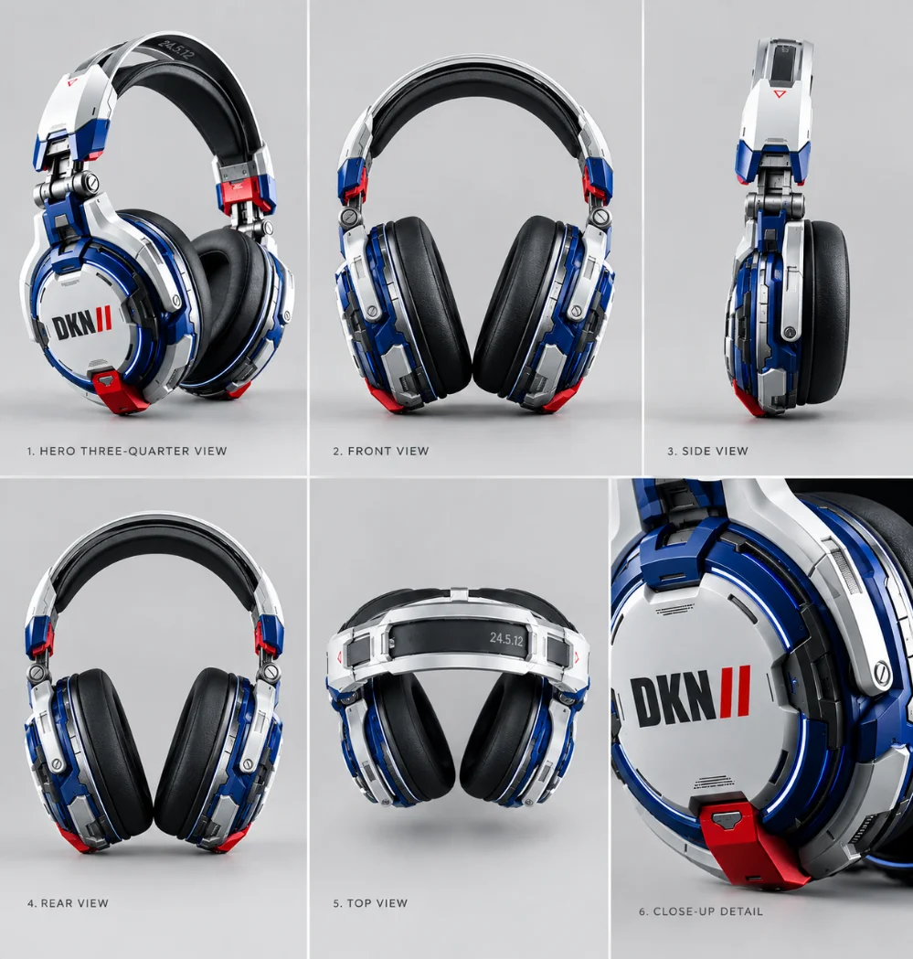
01 — Identity Board
Product Identity Reference
Cocok untuk membuat master reference awal sebelum produk digunakan
dalam berbagai scene atau campaign.
Use the uploaded product image as the highest-priority product identity reference.

Create a clean professional product identity sheet showing the same exact physical product from multiple useful views.

Show:
1. hero three-quarter view,
2. front view,
3. side view,
4. rear view,
5. top or important structural view,
6. one close-up detail view.

Preserve the exact product silhouette, proportions, color, material, finish, packaging structure, labels, logos, buttons, seams, edges, and distinctive details.

Use consistent neutral studio lighting across all views.
Use a clean neutral background.
Keep the same product scale and visual identity across every panel.

Do not redesign the product.
Do not introduce alternative colors.
Do not invent new features.
Do not combine the product with another object.
Do not change proportions between views.

The final result should function as a professional master reference sheet for future AI product generation.
02 — Angle Reference
Multi-Angle Product Study
Cocok ketika produk sering dibuat dari angle berbeda tetapi
bentuk dan proporsinya harus tetap konsisten.
Use the uploaded product reference as the highest-priority identity anchor.

Generate a professional multi-angle product reference showing the exact same physical product.

Create consistent views including:
- straight front,
- front three-quarter,
- side,
- rear three-quarter,
- rear,
- elevated three-quarter view.

Maintain identical product geometry, proportions, dimensions, color, material, surface finish, logo placement, packaging structure, and distinctive details in every angle.

Use the same neutral studio environment and consistent camera language.

Perspective should remain physically believable.
Do not stretch, compress, redesign, simplify, or reinterpret the product.

The purpose of this image is to establish reliable angle references for future product photography and AI-generated commercial scenes.

Identity consistency is more important than creative variation.
03 — Material & Detail
Material and Detail Reference
Cocok untuk produk yang identitasnya sangat bergantung pada
texture, finishing, material, atau detail kecil.
Use the uploaded product image as the highest-priority product identity reference.

Create a premium product material and detail reference board.

Preserve the exact original product identity while clearly showing:
- overall product surface,
- material texture,
- finishing quality,
- edges and construction,
- seams or joins,
- hardware,
- buttons or controls,
- labels and typography,
- distinctive surface details,
- packaging details where applicable.

Use realistic macro and close-up photography.
Maintain physically believable material response, reflections, roughness, transparency, grain, fabric weave, paper texture, metal finish, glass characteristics, or other relevant properties according to the actual product.

Do not invent material characteristics.
Do not replace one material with another.
Do not exaggerate texture beyond what is present in the reference.

The final board should help future AI generations reproduce the product's material identity more consistently.
04 — E-Commerce
Commercial Product Catalog
Cocok untuk marketplace, website product page, katalog digital,
listing e-commerce, dan kebutuhan commercial photography.
Use the uploaded product reference as the highest-priority identity anchor.

Create a premium e-commerce product photograph featuring the exact same product.

Preserve:
- exact shape,
- exact proportions,
- original colors,
- original material,
- packaging structure,
- logo and label placement,
- distinctive details,
- realistic product dimensions.

Use a clean professional commercial background with generous negative space.
Place the product centered and clearly visible.
Use soft studio lighting, realistic contact shadows, accurate color reproduction, controlled highlights, and clean separation from the background.

The composition should look suitable for a professional online store, product catalog, marketplace listing, or brand website.

Do not redesign the product.
Do not change its color.
Do not add decorative elements that obscure the product.
Do not introduce unrelated props.

Prioritize product accuracy, readability, realism, and clean commercial presentation.
05 — Advertising
Product Advertising Scene
Cocok untuk campaign advertising ketika produk harus terlihat
premium tetapi tetap mempertahankan identity yang sama.
Use the uploaded product reference as the highest-priority identity anchor.

Create a premium commercial advertising image featuring the exact same product.

Preserve the original product identity:
exact silhouette, proportions, colors, material, surface finish, packaging, logo placement, structural details, and distinctive features.

Place the product into a sophisticated advertising environment appropriate for the product category.

Use cinematic but believable commercial lighting.
Create controlled highlights, realistic shadows, premium depth, subtle atmospheric separation, and strong visual hierarchy.

The environment may be creative, but it must support rather than alter the product identity.

Keep the product as the dominant subject.
Props should remain secondary.
Use professional advertising composition with intentional negative space for possible headline or campaign copy.

Do not redesign the product.
Do not change the product color.
Do not invent additional product components.
Do not let environmental styling modify the product geometry.

The result should look like a polished commercial campaign photograph while remaining faithful to the uploaded reference.
06 — Packaging
Packaging & Product System
Cocok untuk brand yang memiliki produk dan packaging sebagai satu
kesatuan visual dalam katalog maupun campaign.
Use the uploaded reference as the highest-priority identity anchor for both the product and its packaging.

Create a professional product and packaging reference composition showing the exact same physical product system.

Preserve:
- product geometry,
- product proportions,
- product color,
- material and finish,
- packaging dimensions,
- packaging structure,
- label placement,
- typography placement,
- logo position,
- opening mechanism,
- inserts, caps, lids, sleeves, boxes, or containers where visible.

Show the relationship between the product and its packaging clearly.

Use clean commercial studio lighting and a neutral premium background.
Include one hero composition and supporting detail views.

Do not redesign the packaging.
Do not alter typography or logo placement.
Do not invent packaging components.
Do not merge the packaging identity with unrelated references.

The final image should function as a reliable visual master for future catalog, e-commerce, launch campaign, and advertising generation.
10 / Creator Workflow
Workflow menggunakan AI Product Board
Product Board paling efektif ketika digunakan sebagai bagian dari
workflow, bukan sebagai gambar sekali pakai.
01
Select Reference
Pilih gambar produk yang paling jelas. Prioritaskan foto dengan
bentuk produk terlihat lengkap, fokus tajam, warna cukup akurat,
dan detail identity tidak tertutup.
02
Build Reference Board
Tambahkan front, side, rear, close-up material, packaging,
detail, dan informasi visual lain yang benar-benar membantu
menjelaskan produk.
03
Validate Identity
Periksa apakah shape, proporsi, warna, material, logo, packaging,
dan detail penting sudah terlihat konsisten. Jangan buru-buru
masuk ke scene kreatif.
04
Create Master Reference
Gunakan Master Product Identity Prompt untuk membangun reference
utama yang nantinya menjadi anchor bagi generasi berikutnya.
05
Generate New Scene
Setelah identity stabil, ubah presentation layer: background,
lighting, props, camera angle, mood, atau composition sesuai
kebutuhan konten.
06
Compare Result
Bandingkan hasil dengan master reference. Periksa bentuk,
warna, proporsi, material, label, packaging, dan detail kecil
sebelum hasil dipakai untuk publikasi.
07
Refine & Archive
Simpan reference yang berhasil sebagai master asset. Gunakan
kembali pada campaign berikutnya dan lakukan refinement jika
ditemukan bagian identity yang belum stabil.
11 / Practical Tips
Tips Membuat AI Product Board yang Lebih Konsisten
01
Gunakan reference berkualitas
Gambar blur, terlalu gelap, atau produk yang sebagian tertutup
membuat informasi identity menjadi lebih sulit dibaca.
02
Jangan mencampur beberapa identity
Hindari memasukkan beberapa produk berbeda tanpa penjelasan
hierarchy karena AI dapat mencampur karakter visualnya.
03
Gunakan angle yang jelas
Front, side, rear, dan three-quarter view membantu membangun
pemahaman bentuk tiga dimensi yang lebih lengkap.
04
Jangan mengubah proporsi tanpa alasan
Proporsi merupakan salah satu karakter utama yang membuat sebuah
produk mudah dikenali.
05
Jelaskan material
Material bukan sekadar warna. Perhatikan glossiness, roughness,
transparency, texture, grain, dan finishing.
06
Pisahkan identity dari styling
Produk dapat dipertahankan sementara background, props, mood,
dan lighting berubah sesuai campaign.
07
Buat master reference
Jangan membuat reference baru setiap kali membutuhkan konten.
Simpan satu master identity yang telah divalidasi.
08
Gunakan detail close-up
Detail kecil seperti texture, cap, seam, emboss, label, atau
hardware dapat menjadi bagian penting dari identity.
09
Jaga lighting reference bila diperlukan
Jika karakter highlight atau shadow merupakan bagian penting,
masukkan lighting reference secara terkontrol.
10
Lakukan visual quality control
Selalu bandingkan hasil akhir dengan master reference sebelum
dipakai untuk katalog atau advertising.
12 / Common Mistakes
Kesalahan yang Sering Terjadi
Banyak masalah consistency sebenarnya terjadi sebelum prompt utama
digunakan. Berikut beberapa kesalahan yang sebaiknya dihindari.
ERROR 01
Reference terlalu sedikit
Hanya memberikan satu foto dari satu angle dapat membuat bentuk
tiga dimensi dan detail tertentu sulit direpresentasikan.
ERROR 02
Prompt terlalu umum
Instruksi seperti “make it look professional” tidak menjelaskan
identity produk yang harus dipertahankan.
ERROR 03
Identity tercampur
Reference dari beberapa produk berbeda dapat menghasilkan
karakter produk yang tidak stabil.
ERROR 04
Angle tidak jelas
Meminta “show another angle” tanpa menentukan jenis angle dapat
menghasilkan perspektif yang tidak terkontrol.
ERROR 05
Material tidak dijelaskan
Produk dengan material khas dapat berubah menjadi bahan generik
jika texture dan finishing tidak menjadi bagian dari reference.
ERROR 06
AI diminta mendesain ulang
Instruksi kreatif yang terlalu kuat dapat membuat AI menganggap
produk sebagai inspirasi, bukan identity yang harus dipertahankan.
ERROR 07
Tidak melakukan QC
Hasil yang terlihat bagus belum tentu mempertahankan bentuk,
logo, warna, atau detail produk secara akurat.
ERROR 08
Mengubah identity demi style
Background dan mood seharusnya membantu presentasi produk,
bukan mengganti karakter produk itu sendiri.
ERROR 09
Tidak menyimpan master
Jika reference yang berhasil tidak diarsipkan, workflow campaign
berikutnya kembali dimulai dari nol.
13 / Use Cases
Siapa yang bisa menggunakan Product Board?
Product Board berguna ketika sebuah produk harus muncul berkali-kali
dalam konteks visual berbeda.
01 / CREATOR
Content Creator
Membuat banyak visual produk untuk konten harian.
02 / DESIGN
Graphic Designer
Membangun aset visual campaign dengan identity yang lebih terkontrol.
03 / AI
AI Artist
Menggunakan reference sebagai anchor untuk image generation.
04 / STORE
E-Commerce
Membuat visual katalog dan marketplace dengan produk yang konsisten.
05 / ADS
Advertising
Mengembangkan berbagai commercial scenes dari satu product identity.
06 / SOCIAL
Social Media
Menghasilkan variasi visual untuk feed, story, carousel, dan campaign.
07 / BRAND
Branding
Menjaga visual identity produk ketika digunakan dalam berbagai media.
08 / MARKETING
Marketing Team
Membuat library visual produk untuk berbagai kebutuhan komunikasi.
09 / LAUNCH
Product Launch
Mempersiapkan visual campaign sebelum produk dipromosikan.
10 / STORY
Visual Storytelling
Memasukkan produk yang sama ke dalam beberapa narrative scene.
11 / CATALOG
Catalog Production
Membangun visual produk yang seragam untuk koleksi besar.
12 / CAMPAIGN
Campaign System
Membuat satu identity dapat dipakai dalam berbagai creative direction.
14 / Quality Checklist
Product Board Readiness Checklist
Klik setiap item setelah diperiksa. Checklist ini membantu creator
memastikan master reference cukup siap sebelum masuk ke tahap
generasi visual baru.
0 dari 12 checklist selesai.
15 / Reference Strategy
Pilih board berdasarkan kebutuhan visual
Tidak semua kebutuhan membutuhkan reference dengan tingkat detail
yang sama. Gunakan pendekatan berikut sebagai panduan workflow.
Need
Recommended Board
Focus
Output
Product Catalog
Product Board
Shape + Material + Color
Commercial Product Image
Marketplace
E-Commerce Product Board
Clarity + Scale + Detail
Listing Image
Advertising
Commercial Product Board
Identity + Scene
Campaign Creative
Packaging Launch
Product + Packaging Board
Product + Packaging System
Launch Visual
Social Media
Product Content Board
Identity + Creative Context
Social Content
Product Detail
Material Detail Board
Texture + Construction
Macro / Detail Visual
Campaign Series
Master Product Board
Identity + Consistency
Multiple Creative Assets
16 / Advanced Knowledge
Identity, Style, Reference & Creativity
Di level advanced, Product Board bukan hanya tentang membuat gambar
lebih mirip. Yang lebih penting adalah memahami layer informasi yang
digunakan dalam proses generasi.
Identity vs Style
Identity adalah karakter yang membuat produk dikenali. Style adalah
cara produk tersebut dipresentasikan. Background, color grading,
lighting, props, dan art direction dapat berubah tanpa harus
mengubah identity produk.
Reference vs Prompt
Prompt menjelaskan instruksi konseptual dan visual, sedangkan
reference memberikan informasi visual konkret. Jangan menganggap
prompt panjang otomatis menggantikan reference yang baik.
Consistency vs Creativity
Semakin kreatif scene yang diminta, semakin besar kemungkinan
presentation layer memengaruhi persepsi identity. Tentukan bagian
mana yang boleh bereksperimen dan bagian mana yang harus tetap.
Detail vs Noise
Menambahkan lebih banyak gambar tidak selalu berarti reference
menjadi lebih baik. Reference yang terlalu padat dapat menambah
noise. Pilih detail yang benar-benar menjelaskan identity.
Master Reference
Setelah menemukan reference yang stabil, perlakukan sebagai master
asset. Jangan menggantinya secara sembarangan hanya karena satu
generasi baru terlihat lebih menarik secara styling.
Iterative Generation
Workflow AI yang baik biasanya bersifat iteratif: generate,
compare, identify deviation, refine, lalu generate kembali.
Jangan mengharapkan semua aspek benar pada satu percobaan.
Quality Control
QC sebaiknya memeriksa shape, color, logo, typography, material,
packaging, proporsi, dan detail khas. Visual yang menarik tetap
perlu diperiksa terhadap reference.
Reference Strength
Jika platform AI menyediakan pengaturan reference strength,
image weight, style strength, atau control parameter, gunakan
secara bertahap dan evaluasi dampaknya terhadap identity.
!
Reference Board membantu workflow, tetapi bukan jaminan absolut.
AI Product Board dapat memberikan struktur reference yang jauh lebih
jelas, tetapi hasil akhir tetap dipengaruhi oleh kemampuan model AI,
kualitas reference, prompt, metode image-to-image, seed, masking,
control tools, reference strength, dan parameter lain yang tersedia
pada platform yang digunakan.
Karena itu, jangan menganggap satu reference otomatis menghasilkan
produk identik pada setiap model dan setiap generasi. Product Board
sebaiknya diperlakukan sebagai workflow control system,
bukan sebagai jaminan pixel-perfect reproduction.
Untuk produk yang memiliki logo, typography, legal packaging,
ukuran teknis, atau detail komersial yang sangat sensitif, lakukan
pemeriksaan manual dan gunakan post-production bila diperlukan.
Creator Principle
BUILD THE REFERENCE
BEFORE BUILDING THE CONTENT.
Ketika produk harus muncul dalam puluhan atau bahkan ratusan visual,
jangan mulai dari scene. Mulailah dari identity. Bangun reference,
validasi master product, lalu gunakan master tersebut sebagai fondasi
untuk berbagai kebutuhan visual.
19 / Final Summary
Satu Product Board, banyak kemungkinan visual.
Product Board membuat proses generative image lebih terstruktur:
identity ditetapkan terlebih dahulu, lalu kreativitas digunakan
untuk membangun presentation layer.
STEP 01
REFERENCE
STEP 02
PRODUCT BOARD
STEP 03
MASTER IDENTITY
STEP 04
NEW SCENE
STEP 05
CONTENT
STEP 06
CAMPAIGN
REFERENCE → BOARD → MASTER IDENTITY → NEW SCENE → CONTENT → CAMPAIGN
Protected Download
This download is protected.
Enter the password to continue.